Let your website cast the Northern Lights – Auroral
Our brains work in weird ways. Sometimes you struggle to think of anything, you sit there looking at the blank computer screen for hours, unable to make something look good. Never mind whether you are a designer or developer, you have trouble to put pieces together so the website behaves the way you want. And then, there are the times when you just look at something (that doesn’t even have to be connected to the web!) and a great idea just strikes. It can happen during the night, on a commute, at your friend’s wedding or travelling through Asia. For me, it came when I was looking up the time on a phone at night. My phone’s wallpaper depicts the Northern Lights. It is beautiful, I‘ve been using it for at least two years now. But this time, in the middle of the night, it struck me how awesome it would be if it were animated. Or better yet… to have wallpaper like that on my computer… or maybe a website with a background like it that moves too? I wrote the idea down and fell asleep.
An Idea Revisited
At Lunar we have something that is called Slack Time. It’s the time between projects and you can do whatever you want. Literally! You can read a book, master a new programming language, help someone with their problem or even do nothing (but that’s a waste of time, isn’t it?). I happen to be on slack at the moment, I had just finished the tasks in one project, waiting for the other one to start. The conditions for creative tasks are perfect because World Youth Days is on in Kraków and our office is deserted. I decided to play with the background idea and see what I could come up with. The outcome is a collection of animated gradient backgrounds for the web, all inspired by the night skies. In the next paragraph, I’ll explain how I did it.
The Northern Lights Code
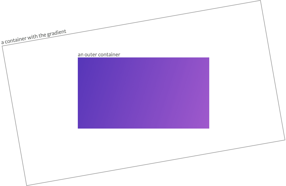
I started with a full page that consisted of nothing but a gradient background done with CSS3 linear gradients. It looked nice, but it was not what I was aiming for. I needed to have it moving in a very delicate, almost invisible way. You might remember my previous blog post about the FLIP technique and a performance of the animations. You can’t just animate the background image and the gradient properties. It is slow, the animation is not smooth and there is a jank. I tried to animate it anyway, just to see the results in Chrome FPS meter. The animation moved with inconsistent 2-55 FPS. Not good enough. I needed to approach it differently. It was not a long search because you don’t have many options if you want an animation that performs well (FYI, you should only animate the opacity and transform properties). So I started playing with rotating and translating my gradient’s position to achieve a sense of a delicate movement. That was the way to go! I added an animation that sways the container. But there was one problem: with the gradient the whole container was moving, it was very annoying because the browser’s scrollbars would jump in and out of the page. The good thing was that it was easily solved by setting up an outer container with its overflow property set to ‘hidden’. It can be any size really, I chose it to span across the whole viewport. One thing to remember was to make the gradient container much bigger so that it wouldn’t show white space at the corners while moving. To have it twice as big as the container felt reasonable.

Take look at the code:

Starry night
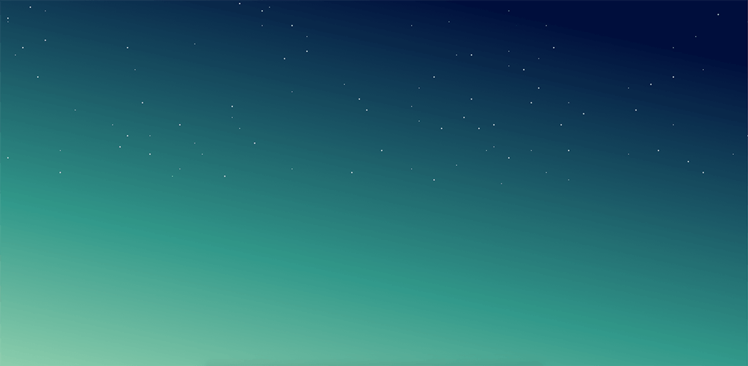
The effect felt really mesmerising. But it still lacked something that my iPhone wallpaper had: a tonne of small white dots – stars. Of course, I didn’t want to add 100 elements to the DOM, it would be a killer for the website performance. I decided to use a one small div that is 1px wide and tall, and “copy” it as many times as I wanted thanks to the box shadows and absolute positioning. There is nothing more helpful than a Sass functions for that, just take a look:
And the effect:

The coolest thing about this is that you can choose the amount of stars that suits you and that every time you compile your Sass file the stars will be placed somewhere else due to the random() function. :)
Summary
I hope that you enjoyed the article. If you like the backgrounds, remember to give the repository a star on GitHub. I also enjoy seeing pull request (or even Issues), so please help me make the library better. You can also follow me on Twitter or Snapchat to be the first to find out about the improvements to Auroral and all the new things I come up in the future.
