How we work pt. 2: Measurable Happiness.
Hello! Please, tell us how you feel.
We do this in many ways: send Kudos, submit a topic during the weekly lean coffee, have a real coffee in our comfy kitchen or…
Draw a smiley on a whiteboard.

Or beer. Or Pacman. It’s up to you.
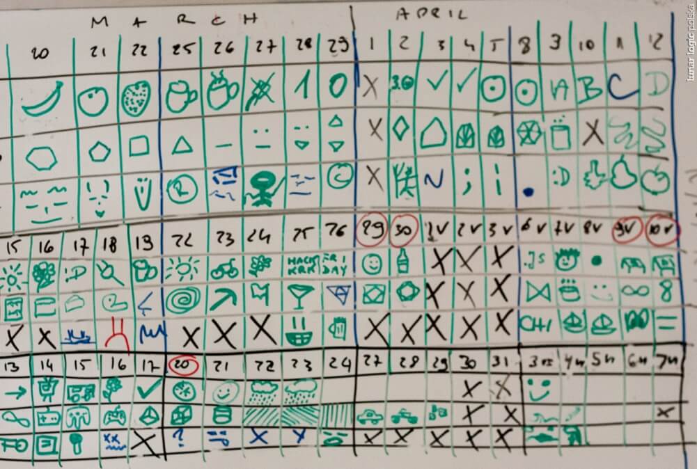
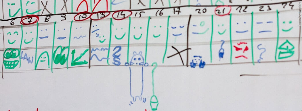
The Happiness Chart is a kind of universal mood indicator. We draw shapes on our whiteboard after each stand-up to tell others about our day. Green goes for “happy”, blue for “so-so” and red means “sad”.
That’s it! And it works – a couple of :( in a row show that something’s wrong. Get up and do something about it.
If paired with a project management tool (we use our own Kanbanery), you may evaluate which tasks your team drudged through and which made their day.
The chart is 100% transparent, just hanging on the wall for everyone to see. Maybe a passer-by got a solution that the whole team was looking for last week? Or a cute cat picture to lighten the atmosphere?
There’s another reason why we use happiness charts. According to some stereotypical belief, programmers aren’t very keen on talking about their emotions.
Writing them down, compressing into three “states” (happy, so-so, sad) – that’s a different story.

